Category Archives: Uncategorized

rant about software documentation / website trends

I draw my examples from open-source software (OSS) projects, but the latest webdesign trends in general really tick me off. I like objects that convey information well, and such objects we often find visually pleasing as well, but it we shouldn’t be sacrificing function for form, form should enhance function. Yes, I have strong opinions about design for conveying information.

Especially when I’m doing technical work, such as evaluating whether to adopt a piece of open-source software (for instance, try the picking a javascript tool to learn for the first time: d3, angularJS, node, flask, kinect.js, jQuery), I really appreciate “first contacts” that tell me in 10 seconds :

  • What is this thing?
  • Why would I care about this thing?
  • Is it worth the effort to learn this thing?

Source: http://stevelosh.com/blog/2013/09/teach-dont-tell/, which is a post “about writing technical documentation for programming languages and libraries.” Really, read it if you are at all interesting in having anyone else use your OSS project. After all,

The purpose of technical documentation is to take someone who has never seen your project, teach them to be an expert user of it, and support them once they become an expert.

okay, so what’s wrong with the internet today, you might ask?

chief complaints

1) Dumb websites that are 5% content and 95% whitespace.

2) Why do I have to clone, install dependencies, and compile my websites now? Whatever happened to good ol’ HTML view-source copy-pasting?

complaints in rant-worthy detail

1) Whitespace is good in moderation. Yes, don’t be afraid of whitespace. No, don’t waste my time scrolling down through empty galaxies of space. WTF. Hasn’t anyone heard of designing “above the fold“?

I’m not browsing for the latest python library to use on a tablet, I’m either on my laptop or my phone. What is this tablet interface thing? You can design for mobile / tablet without making your default website look butt-ugly on large monitors. I’m particularly ticked off right now because two of the projects I had bookmarked a month ago as being examples of “good homepage design” have converted into derp designs :/

djangoproject.com

december 2014

421
Source: https://www.djangosites.org/s/www-djangoproject-com/

february 2015

Screenshot from 2015-02-06 03:04:55

ugh, it’s like watching ubuntu upgrade into a progressively worse and worse UI-wise. (for the record, I use cinnamon and docky on Ubuntu 14.04 and I will fight to keep this working on my laptop). THERE’S SO MUCH USELESS WHITESPACE at the top left / right, ahhhhhhhh it’s infuriating to look at (I’m also really hungry, which is probably why I’m so grumpy right now)

As John Morris succinctly put it in Annoying Trends in Modern Web Design:

Minimalism is the practice of reducing fluff and streamlining websites.  When done correctly, this is very pleasing to the eye and makes finding what you want easy.  But when taken to far, your page becomes pointless.

good design

Screenshot from 2015-02-06 03:05:33

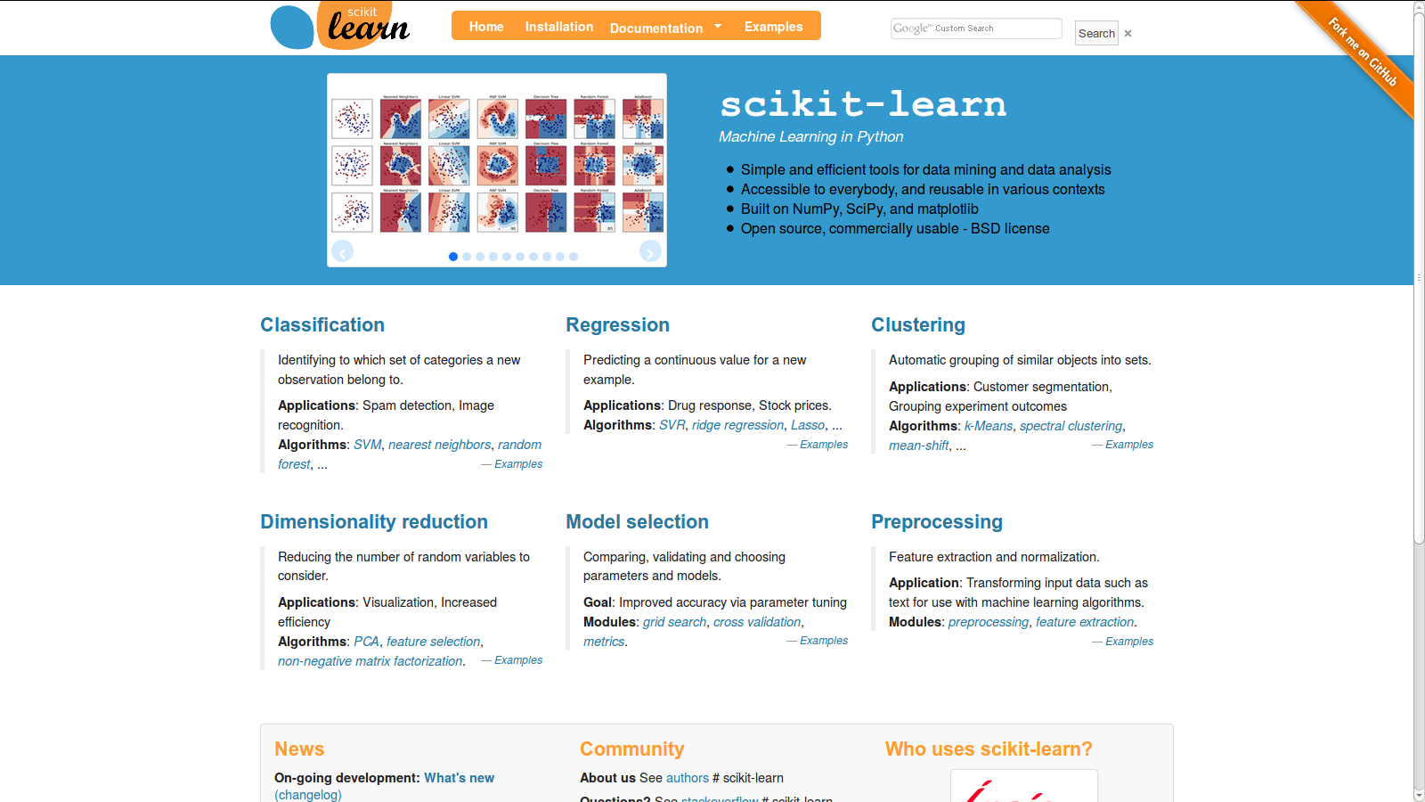
Whitespace? Yes. Mobile-friendly? Yep, checks out on my phone. Conveys necessary information in an efficient manner? Yep.

The other website is getfedora.org, but I can’t find a “before” screenshot for them, so I’ll spare them for now.

I started on this post a week or two ago, and I can’t quite remember the other points I was going to make, nor do I feel quite so angry (I think I was tired, sleepy, and hungry at the time of this post), but upon further reflection, I think the key issue I have with all these sites obviously designed for the tablet is that,

1) on the desktop, there is no easy “page” metaphor where you flip between one section to the next with a swipe of your finger.  If you’re going to treat tablet/mobile users as your first-class citizen, include navigation so that your site is intuitive on the desktop as well.

2) All the spaced-out, layered information (layered because you hid all the content under a metric ton of whitespace) (it’s clear people are designing for marketing: get them to click the button!) makes it very hard to build a mental map of your site. It’s like reading a book for ELDERLY PEOPLE WHO CAN’T SEE


EVERYTHING


IS


SUPER


SPACED-OUT


unnecessarily so. There’s a reason why everyone doesn’t just use the EXTRA LARGE FONT setting on their computers or ebook readers. It’s uncomfortable, and I can’t build a mental / visual map of where all the information is. Take this site:

https://www.shuttleworthfoundation.org/fellows/

This site is well-designed for consuming information / first-time users exploring the site, but not for linking to content or commenting on it or remembering where things where on the site.
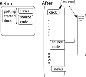
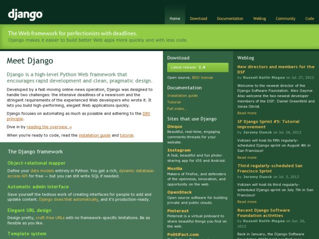
modernwebdesignfail


Before: 

Getting started is up top, source code is to the right, news about the community over to the left.
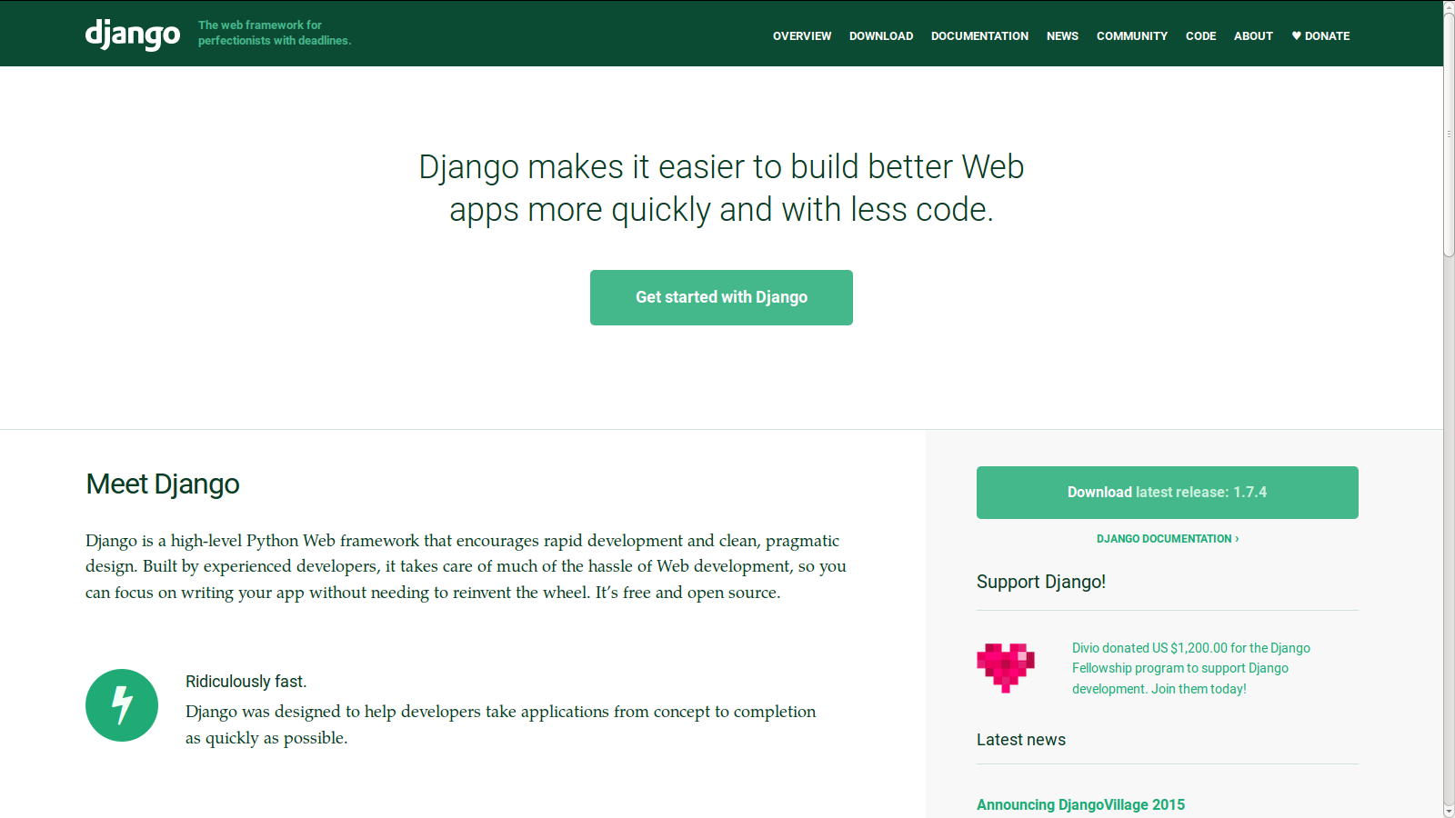
After:

Getting Started: Click the top button, then the link in the first sentence on that page.

Source Code: Scroll down about halfway on the page.

News: Scroll down all the way on the page.

Conclusion

stop copying other people’s designs willy-nilly to look cool without thinking about the usability of your site. =___=

Sparkyard: About

Published on: Feb 24, 2015 @ 7:12Edit

This site created by Nancy (orangenarwhals) in Feb 2015 order to have fun creating things. The focus is on quantity over quality: practice, practice, practice.

Monday Music A new piece of music, speech, or podcast every Monday. As flash fiction is to writing, so monday music is to music-making. or something.
Tuesday Terrible Startup Ideas A new terrible startup idea every Tuesday. From concept, to user interviews, to wireframes. An exercise in product design and idea iteration.
Wednesday Writings A new piece of writing every Wednesday. Flash fiction, poetry, generative text, ascii art, whatever involves text is suitable for Wednesdays.
Thursday Robots A new robot every Thursday. Loosely, any electromechanical object is suitable (no, twitterbots do not count).
Friday Fotovideos A new photograph or video every Friday. Street photography, tutorial videos, timelapse videos, those all belong to Fridays.
Saturday Scribbles A new scribble every Saturday. Whether it is webcomics (An Incoherent World), typography, propaganda posters for the Hexapod Revolution, or random scribblings, it belongs to Saturdays.
Sunday Silly Papers A new silly academic paper idea every Sunday. We show how everyone in the world, including people on the internet, can be a scientist by addressing the silly everyday questions with scientific rigor.


the visual language of crackpot websites (quick thought)

After visiting weatherishappening.com (boston’s most trust source 4 weather)

https://www.facebook.com/weatherishappening
source: https://www.facebook.com/weatherishappening

and calling the hexagonal awareness hotline at 617.600.0606 “for immediate hexagonal assistance”,

elect-hexagonbot
source: http://hexnet.org/gallery

i developed this conspiracy theory that all crackpot websites shared the same visual language.

In general, a twisted visual style to match the twisted intellectual content. —timeblimp.com

Sadly my conspiracy theory has been dis-proven, which just goes to show how poor a crackpot I make 🙁

Thought: what do crackpot websites in other languages look like? Surely there must be crackpot Chinese physicists. do they make classical ugly websites along the lines of timecube.com? or is the more recent widespread internet usage in China than in US contribute to visual differences in crackpot websites there? What about Arabic or any other language?

Thought2: I should make a crackpot-CSS-styled website that actually gives very useful technical information, for instance serves up digikey datasheets.

Thought3: The complement to that is the take the trending-startup-webdesign or facebook design or hip bootstrap styles and make a slick looking website utterly filled with crackpottery. may encounter difficulty distinguishing it from your generic Industry Changing Startup website though. hmm.

anyway, you tell me which of the below websites are crackpot websites:

Screenshot from 2015-02-21 01:26:00 Screenshot from 2015-02-21 01:24:32 Screenshot from 2015-02-21 01:19:04 Screenshot from 2015-02-21 01:18:33 Screenshot from 2015-02-21 01:18:16 Screenshot from 2015-02-21 01:17:10

answer: all crackpots, probably, except weatherishappening (for sure) and hexnet (probably, he seems like a pretty chill dude. he showed up at hexacon2013.mit.edu, and really, if we don’t judge people who collect stamps (they even have a name, philatelics), why should we judge people who collect hexagons?)

And to close, here’s a gem of a crackpot:

http://dpedtech.com/dirac.pdf

NB: You can read this essay as science fiction or science fact. It’s up to you.

First Some Theory

One of the most elegant forms of ZPE devices is the Dirac Current Positron Generator. Once you can finesse the low energy generation of positrons from the quantum vacuum, letting nature supply the bulk of the energy requirement for the task, you then can release large amounts of usable “free energy” by simply letting the positrons annihilate with electrons under controlled conditions. …

What is nifty about our process, though, is that we can “freeze” the sc condensate into a permanent steady state much like the frozen positrons that are stuck inside the protons or like concubines sequestered in a harem. The sexless quark eunuchs insulate the sexy positrons so the poor horny bachelor electrons nearby just can’t get in close enough to mate with them and go out in the orgasmic glory they desire. So the charged up electrons do the next best thing and go into “mental” fantasies and complex ritual patterns. That generates EM fluxes and molecular structures that weave a complex web around the protons. A kind of “civilization” emerges with a wonderful variety of long-lasting sublimation rites.

wat. what did i just read.

watttttt.

yours truly in wasting time on crackpot websites,
~ orangenarwhals

~~~~END~~~~

thanks to the original reviewer / theorist of just how crackpotty these crackpot websites are, http://timeblimp.com/?page_id=286

The TimeBlimp Universal Theory of Crackpot Websites:

1. Horrendous grammar, spelling, and general use of language

2. Declaration that some pillar of science is completely wrong

3. Unprofessional, irritated, emotional tone to the explanations.

4. They usually have websites (what better way to publish to the masses), and their websites are almost always one gigantic continuous long stream of text and figures in one page. The site design is awful, with clashing colors, abuse of blinking text, terrible font sizes and colors. Oh, and they often use ALL CAPS TO EMPHASIZE POINTS, and embellish important sentences with lots of exclamation points!!!! In general, a twisted visual style to match the twisted intellectual content.

5. Invention of their own definitions

Head over to timeblimp.com to read in-depth reviews of each crackpot website, as well as the reveal of the winning crackpottiest crackpot website!