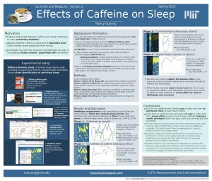
This is a followup post to Caffeine’s Impact on Sleep, Inkscape A0 Scientific Poster draft
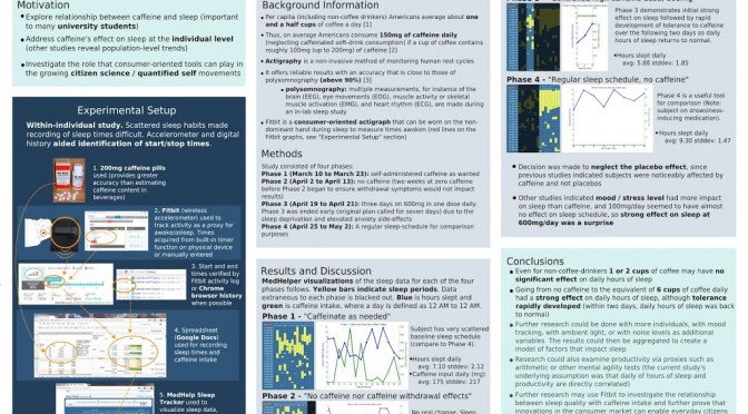
Finished my 42”x36” poster today (turns out 2.671, my Measurement and Instrumentation class, didn’t want A0). I saw some awesome horizontal and vertical designs Tuesday, and now I have this super-cluttered and not very aesthetically pleasing poster *sigh* Oh well. I liked my draft version better for its simplicity and think I have too much text on this final version.
 |
| Larger size PNG image available on dropbox, |
!! PDF version available (large file, ~10Mb), as well as SVG source. !!
And thanks to OnlyPositive for the picture of the sleepy cat.
Matlab
Here is the matlab code I used. It’s very messy and I don’t actually understand what it means. In fact, I had to do post-processing of the Matlab > Export Setup > Rendering, Resolution = 300 > Export > figureN.png in the GIMP prior to dropping it in Inkscape to get the images I wanted.
figure
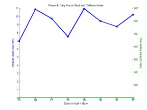
caffeine4=[0 0 0 0 0 0 0 0];
sleep4=[6.95 10.87 9.75 7.52 10.95 9.43 8.75 10.23];
day=[25 26 27 28 29 30 31 32];
[AX,H1,H2] = plotyy(day,sleep4,day,caffeine4,'plot');

title('Phase 4: Daily Hours Slept and Caffeine Intake');
xlabel('Date (in April)');
%xlim([26 13]);
set(gca,'XTick',25:1:32);
%set(gca,'box','off');

set(get(AX(1),'Ylabel'),'String','Amount Slept Daily (hrs)');
set(get(AX(2),'Ylabel'),'String','Daily Caffeine Intake (mg)') ;
axis(AX(1),[25 32 0 11]);
axis(AX(2),[25 32 0 700]);
set(AX(1),'YLim',[0 11], 'YTick',0:1:11, 'box','off');
set(AX(2),'YLim',[0 700],'YTick',0:100:700,'box','off', 'box','off');

set(H1,'LineWidth',3,...
                'MarkerSize',7,...
    'LineStyle','-',...
    'Marker', 'o',...
    'MarkerEdgeColor', 'none',...
    'MarkerFaceColor', 'b');
set(H2,'LineWidth',3,...
                'MarkerSize',7,...
    'LineStyle','-',...
    'Marker', 'o',...
    'MarkerEdgeColor', 'none',...
    'MarkerFaceColor', 'g');
Above code resulted in this graph:
This data was actually 25 April to 2 May, but instead of learning about timeseries in MATLAB, I just cheated and stuck “April / May” in the xlabel and used 31 and 32 to not break my code. I planned to post-process in gimp to turn “31 32” into “1 2” but forgot to do so.
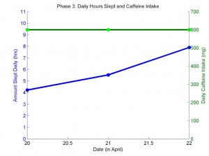
For phase 3, I couldn’t figure how to get rid of the 20.5 and 21.5 tick marks when I expanded to graphs to reasonable size, so I did post-processing in GIMP. Here are the two images I smushed together into the third:
 +
+ =
=
Misc. other tricks too lazy to document fully:
Using “shift-J” in Vim to turn newlines (ctrl-click-drag to get a column of values from google doc separated by newlines) into spaces, which Matlab uses to delimit vector data.
Making Instagram-like effect with kitten in top-left corner via kitten > right-click Add layer mask > (1) Gradient tool white-to-back, radial, click-drag from center to slightly past edges of images. This transparency-ed a large part of the cat face so (2) Ellipse select most of cat face, Gradient tool white-to-light-gray, radial, click-drag from center to edge of ellipse.
Inkscape, Filter effect > Make arrowheads match color to the lines. (If you decide to change the color of the arrowheads).


Hi, I am new to Inkscape and this helped me a lot! Do you mind if I use your layout as a starting point for my poster?
Sure thing, don’t mind in the least! I hereby publicly license my files as CC0 (https://creativecommons.org/publicdomain/zero/1.0/), do whatever you want with it.
Glad you found it useful — feel free to link from here to your version of a scientific poster in Inkscape when you’re done!