i realized i hadn’t updated my resume since before I graduated from MIT ^^;
also it was butt-ugly
so i updated it
i’m not super-happy with it (still too little whitespace), but going to call it a day
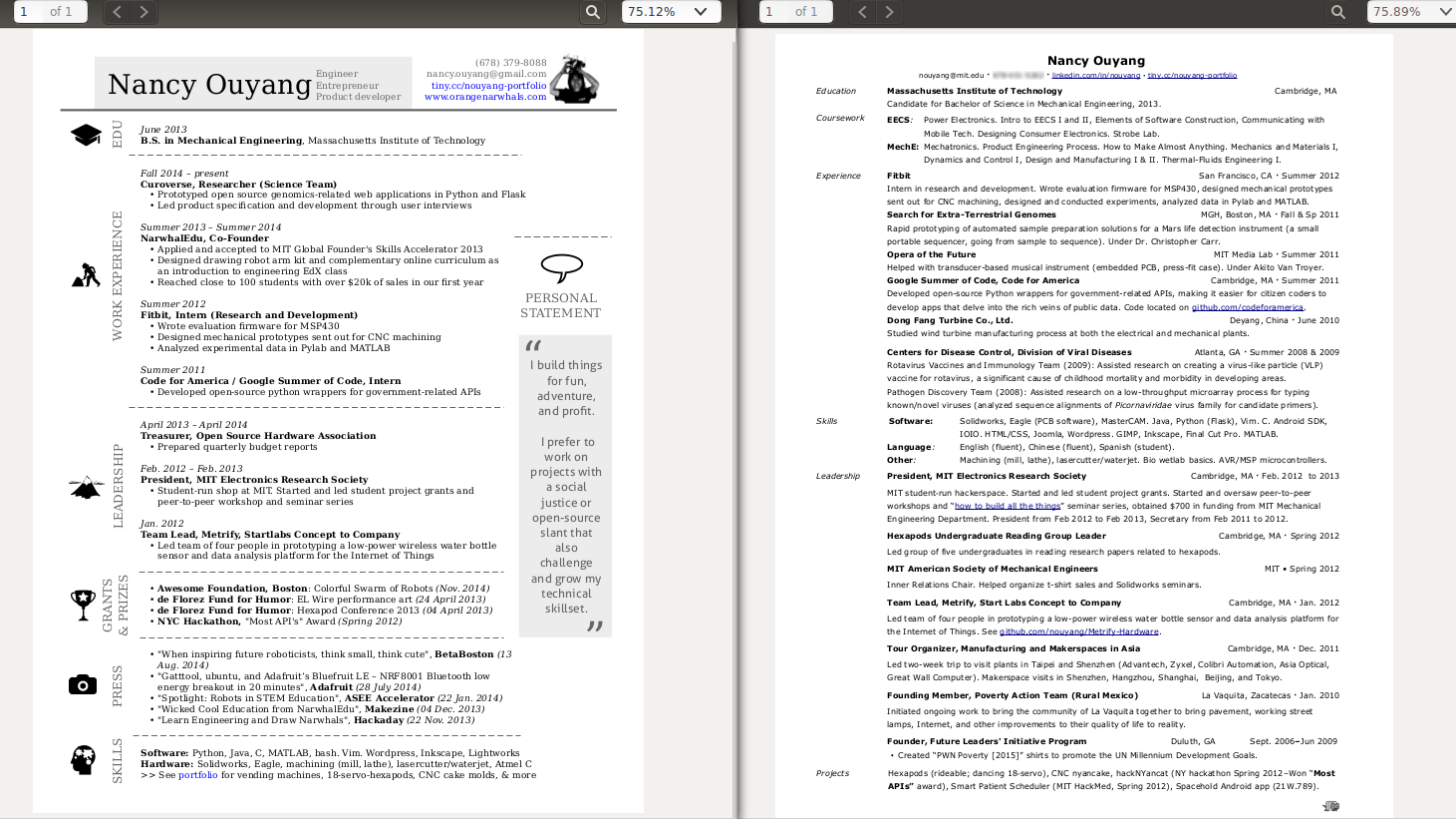
after/before

librewrite ODT
as mentioned in older blog posts, the old one was an openoffice / librewriter template, which I am re-posting below:
the newer one I made in inkscape, with a lot of work done by hand :/ (namely, I really hate that I manually indented some of the lines)
inkscape SVG
oh well. here’s the inkscape source files
(all the icons are from openclipart, so they are public domain. Well, I made the “man at work” icon into a “woman at work” icon, which I hereby release into public domain if you really care).

!!! the bad part: inkscape doesn’t let you create links out of individual words, and also (I think) has issues exporting those links to the PDF form, so take it as you wish.
also, when you’re copy-pasting text to move it around (e.g. when ordering things chronologically) inkscape loses the formatting
also, I recommend writing your text up first, because editing text in inkscape can be very slow.
next, updating my portfolio? meh, so much work. maybe I will just make a jquery bootstrap-esque carousel, haha
design principles
alright, the main updates were
- I’ve now seen people react to and judge resumes, including my own, and also I’ve grown old and jaded and have a shorter attention-span, so I’m way more decisive about cutting stuff out when it eats up my whitespace. Goodbye, high-school internships and all my MIT undergraduate “research” (UROPs), which weren’t that productive. Oh, you don’t fit on one line? Goodbye, keyword “skills”
- I decided I liked icons
- I realized that press / prizes / grants matter to people
- I added a personal statement and the “keyword roles” (both blocked out in grey), since people at bigger companies (hi Apple) get confused when trying to pigeonhole me into an Employee Role.
- Shifting from an openoffice table-based layout to Inkscape allowed me a lot more flexibility in laying things out
- Use a google voice number instead of my actual number, it’s just sensible to do so.
Aside from that, some simple design principles
- Try to keep margins even
- Keep formatting similar for logically related things (e.g. all the dates are in italics)
- Limit myself to three different font sizes, max
- Three colors, max (black, 60% grey, and blue)
- A single font
- Use all the variations in text at my disposal — dotted lines, CAPITAL Letters, grey/black text, bold italics
- More whitespace! All hail whitespace!
- Write just enough to be interesting / spark a conversation about my project. buzzword buzzword buzzword. (as opposed to delineating everything I did)
- As a recent graduate, definitely one-page resume max
MAJOR Caveat: I’ve yet to get a job based on my resume or portfolio. ^^; At this point, I sink time into them as “information design” / “graphic design” exercises, for fun. I am interviewed for and accepted for jobs (contract, full-time, or internship) the normal way: networks (the MIT network is pretty strong) and through projects / work I’ve done.
UPDATE
After talking to a few people, everyone agrees the new version looks better.
- “You like … look like a person rather than a piece of paper”
- “The left one gets my attention”
Ways I could improve:
- probably my new version is not very OCR / machine-readable due to its weird structure (esp. with the personal statement)
- “Last thing: when someone looks at your resume, they don’t want to know your history; rather, they want to know your potential. They want to know how you would fit in any of a variety of positions that they have in mind.”
Also, I loved this description of MITERS / being president of MITERS:
For instance, when I think of MITers, “student-run shop” is pretty much the blandest possible description of the place. When I think of MITers, I think of people voiding warranties to make things that are amazing. I think of people throwing caution to the wind and making cool things because they can. And as the president of MITers, I envision you as a bull-rider with a gentle touch — you have to let the crazy happen, because that’s the magic of the place, but you still have to keep things under control.
Oh, and some more info about inkscape pdf export:
“also a couple more things you might want to be aware of with inkscape PDF exports:
0. it cannot embed fonts, only outline them, and causes the PDF to no longer be machine-readable. this may impact your ability to gain visibility by the unfortunate robot screening systems many US companies use (then again, personal opinion is that i don’t care to work at most of those companies that do this anyway … you’re good if you think the same way, but if you’re planning to throw your resume into a career fair website you might want to be careful)
1. i think Inkscape’s outlining isn’t very optimized — in PS/PDF language it’s possible to outline one glyph and then reference it multiple times, which Scribus does, but i think Inkscape just outlines a separate copy of each appearance of each glyph, which makes the resulting PDF larger than it really should be
… not deal-breakers but just to be aware of”


