Interaction Design | guest lecture, JoEllen Kames, 21w.789

http://web.mit.edu/21w.789/www/syllabus12.html
http://web.mit.edu/21w.789/www/notes/designnotes.pdf

a semester compressed into 3 hours
UX design, IxD, Industrial Design

Going from Interaction Design to Interface Design

Modelling:
We are defined as mobile application. How does it relate to someone’s life?

Why not jump straight into making it?
* Define if need to get information from elsewhere
* e.g. weather and stocks
* Drawing a picture -> extremely powerful for getting on same page

Also, show in 5 to 10 minutes to people who decide future of your project

Examples.
HCI: using metaphors. 2007: future of the phonebook?
2007: motorola owned the phonebook. and we were a walled garden (no things from other mftgs). mostly own own OS and had a lot of control. some look into social networking. realize that things may be beginning to change. when talked to people, not envision phonebook but rather friends. google was working on android, iphone come out but very app-based. motorola supporting 8 different platforms at time.

more hubs and spokes.

before and after metaphor: how does it make people’s lives better?
at the time, had to do everything manually. type in each person’s phone number. After: hope to make it more like learn what friends up to than management heavy.

3rd mental model: how do people think about the people in their lives? how did they cluster / organize them?  it is an anthropomorphic well-known phenomenon that they validated with their own data collecting.

2007: can be able to manually form groups. But wanted a much more fluid structure. > favorites.  go from 30 contacts avg to 300, 400, 500 > how to manage that information.

How to integrate data from other sources (not happen at the time)?

Model: determine who need to ask to do work (flickr, yahoo, etc.) -> diagramming it

Content types: from demanding to … patient ones… how to give Content a Behavior on a device.

User type: students, faculty, everyone (?___? hard to design for but common e.g. for weather)

Motorola has common archetypes of people (amalgated from real people). Very specific: what devices, what media, their life story.  A lot of back and forth, but now fairly fixed ACROSS projects –> but does depend on the type of project. Segmentation of people. Have twelve (making whole device, not just an app!). From leading edge people to …

administrator often forgotten -> are the views / behaviors of your system different?

so for us, maybe lump all students together.

^– more high level
===
structure, flow, and process:

In reality: do go back and forth, since when have an idea hard to not sketch it out

undoing wireframes is expensive and tricky

also at information architecture: business owner, designer, and engineers all agree at use cases and use flows. Explicit among stakeholders -> saves a lot of money. Esp since once people see screens, engineers can get very attached to them. so efficient to get buy in earlier on.

For world today (not in 2007) there are fairly standard operating systems.
understand conventions of OS working with

iOS: very clear and approved guidelines
Android: less wild-west, ice cream sandwich: much more codified how it will look / interact: google suggesting will look better like ice cream sandwich

Where does back button? Android: hardkey, iOS: softkey at top.

  • What is goal of user 
  • then how it is achieved (send message to send messag,e or to meet up with friend.
    • life, experience, end goals.
    • life: take care of people they love, have a harmonious family
    • experience: do they want to have fun or just get something done,
    • end goals: when find app in store, what expectations have after invest time / money? must match goals very quickly or else may use once and discard at spring cleaning
  • Input methods
    • all in mobile, is there kyboard, voice, gestural (shake it), webapp, 
    • views: calendar (month, day, agenda)
    • individual contact, whole list, or visual view,  all contacts, can be complicated depending on amt of info
  • key path scenarios:  going through app
    • use case clusters
    • engineers pretty used to it
    • very specific: address or not address , set specific scope and priorities
    • first column: core to system (ship) or important (to vision) or nice to have
    • other cols: platforms and such, feasible or not
    • what implement by end of semester or not, prioritize implementation and can think in phases, can have placeholders structurally even if to reveal to end users initially
  • (more like websites than mobile apps) information organization: top down, you decide categories and then fit the stories, or draw categories by looking at all the stories that you have
  • mobile: tends to be pretty sequential because of screen size: do one thing at a time. Hierarchical: common as a site map unless applying job / purchasing something, becomes sequential
    • trickier on small screen because: C may be most interesting in app, may need to be pushed to beginning so they get value. Not first in how you think they should do, but in delivering value to them
    • 2d contacts, and then 3d contacts to groups
  • Interaction model: How to filter: 
    • contacts, A-Z, by location, by upcoming meetings, people with recent updates, 
      • individual contact: communication history, groups they were part of, shared events, 
  • Hardest part of app: facebook not want to be next to twitter, myspace, not on same page, etc. Struggle to make legal agreements and desired ux. Explain from UX why best interest from them to be together.
  • All of the boxes are numbered and represent unique screens (see ppt)
  • Will go back to sketches for new apps / versions -> due to variation between blueprint and what actually got built
  • Sketch out possibilities before building
    • list boring to interact with, how to make it more lively > a carousel
    • vs. undo built things to do better way (not necessarily more efficient, but also just visual explorations)
  • A few notes: no right visual language, although there are common standards
    • box for screen, diamond for (???), 
    • key is to be consistent with design language
    • make sure to think about the background where info comes from
====
Interface Design
Standards of best practices: Wodtke:
  • way posting -> of state
  • avoid getting in error state
  • make sure you realize some people new to smartphones, unlike you the expert
  • and other resources are way more specific
Ice cream sandwich and iOS: have very specific look n feel / conventions
2007: no clear platform, so screens are platform agnostic
There were dropdowns and touchscreens before iPhone (e.g. in China, with stylus)
  • dropdowns are tricky, avoid them
  • there are conventions, e.g. radio buttons vs checkboxes etc.
  • dropbox in middle of screen unheard of in 2007
their design 2007: when people using Razor, and a closed-lid interface (secondary screen when closed), this is months after iPhone released -> moving to touchscreen interface
people have data plans, easy APIs for webservices, internet
facebook: only one mobile guy at time, they are tiny startup in palo alto. number one mobile manufacturer Motorola at time.
screen capable of displaying it all, interface rich enough to navigate all -> device to device interaction is a new paradigm and not all in same ecosystem -> can it interact with old devices? beyond walled garden of own stuff (internet of things!)
  • solve a real need that people have -> makes their life better in some way
  • and keep iterating
  • and some fairy dust for making it delightful
and have more basic, static -> dig through menus to find it
wireframes are pretty static -> mix of screens and flows. in end state very sequential medium, so end up screens and flows.
e.g. how to create contact from scratch
Codification of prototype: how are we trying to communicate with with this prototype -> print out and put above desk
  • games are a new type of prototype
  • used to get a group of people to build consensus
Books: about face 4 (not 3) now
Assignment:
pick 3 or 4 use cases: and we will evaluate each other at next class. so classmate will work through use case via paper.

21w.789 lecture two notes

http://web.mit.edu/21w.789/www/syllabus12.html

Ways we screwed up: 
Didn’t agree on research questions beforehand so when we talked to people in parallel fashion, we explored different topics (yay data that’s hard to affinity group), e.g. one of us talked to people about how they share projects, and someone else did how people who use location services, and someone else asked specifically about a keyholding (indicating when rooms useful to multiple people, that only some people have open/close access to, are open) app

I wrote summaries of each of my question instead of interesting quotes

MITERS survey summary 
(talked to four people over an hour)
(# of people)

  • IRC used by two people for instant help
  • posting pics to facebook as project sharing (2)
  • facebook, forums, only give superficial “that’s cool” feedback when post pics (3)
  • users from hackaday gave more technical questions which ___ liked
  • email pictures to parents when major milestone, talk to them on phone (1)
  • find out about projects via facebook (2 people)
  • find out via google reader, blogs (1)
  • take pics with smartphone and instantly upload (1)
  • get camera out and upload to blogger, post ~2x/wk (1)
  • reddit sometimes discover projects (2)
  • call mom and talk about projects (1)
  • no good way to collaborate on engineering projects currently, solidworks not in cloud (1)
  • most of them project sharing in person at MITERS see what people are up to (4)
  • ask for help from people at MITERS if around (4)

My notes from class:
====
typical study, 1500 to 2500 notes

this week: go from data to project (project due in 2 weeks)

contextual design –> how things flow between people, spaces. how to understand reactions. how to figure out bottlenecks. physical medium, information flow

Flow model – for music. (cds, cars, work, homes). Info flow: who talk to (significant others, not so much family members)


=====
Conversation analysis — text logs starts and ends, requests. weilenmann — a paper. not allowed to call in fitting room – but perhaps texting would be okay.

crit incident analysis – used in usability analysis of existing products, or when beta

focus: grounded affinity analysis to organize large amounts qualitative data.  Not! to prove / disprove theories. (because only talk to 3 or 5 people). design something to work with what i’ve observed for these datapoints.

affinity can be very large — covering walls of room. 2500 sticky notes.

affinity — a hierarchy – raw data, exact quotes/observations, photos,

Find similar problems -> group and label. Then group again.

Comes from science – hard to know all the hypothesis before in field. so instead bottom up, collect lots of data and then develop theories.

Each note — 1 or 2 sentences, single idea.
Not problem for us, but in large groups — hard to find notes! know it exist but in 1000…
colleague — camera + projector -> talk and it will highlight on wall where note is (search text)

Themes — common terms, often exact quotes useful b/c that’s the order they have to think about it today

In lab / research –> try to get diverse team (marketing, biz, research, engineers, designers) because each person approach data differently. 4 to 5, 6 max.

Think about research questions when starting out
And how perspectives might bias our interpretation (if already have idea of what want to build)
Read note aloud so everyone knows and agrees what sort of groupings

GT Data can be used for years and years — public in academic so people can use it.
BH standard in industry — miss a lot of what’s going on if just grouping own insights instead of actual data quotes
New concepts —  quantity over quality (for us, 30 mins affinity, then 10 15 mins throw out ideas)


2500 data points
200 ideas
How to prioritize? e.g.

  • excited about idea (spend next 10-12 weeks on this!)
  • market size, will people pay for it / monetizable?
  • can build in scope of class
===
break after 40 minutes regroup
===
all communication done with intents (processes are isolated)
apk – essentially a jar file for each app
content provider — access contacts (through urls like rest services)
multiple activities per application
manifest file describes whole application — which activity start by default, which permissions (sensitive apis e.g. mic, video, phone, sms) will be used –> a way for developer to state to user what things will be done.
default activities take up full screen but can have floating / embedded within other apps
services — spawn thread to not block UI (so run in background). Start it as sticky — otherwise android will start kill apps when memory use too much, services are one of first thing — will know to restart app as soon as memory available)
Intents — one of coolest things on Android. glue between activities. 
— define abstract “I want to send this” and can open up UI menu –> user chooses how to fill the intent (all those apps have registered that they can “share a photo”)
safest way — stick with android sdk platform menus. 
Design philosophy — generic system level intents (share a photo) and any app that can handle it registers to do so
action_view -> launch browser or contact (e.g. 1st contact in contact list, REST services)
Debugging –> bring up chart to refer to lifecycle of activity
Activity priority list –> mobile still resource constrained. kill from bottom up -> hopefully foreground process (actual interact) not killed. hopefully not memory constrained (a lot of memory now on android devices).
Android Eclipse nice graphical to create layouts. res > xml for each activity in app. And nice graphical interface. Tab on bottom to go to xml file (change default names from button1,2,3 etc, tweak by fine degrees)
graphcontent -> as big as need to. fillparent –> as big as possible.
all things need height and width.
r.java searches “layout” source folder (the “xml” source folder is app specific to helloIOIO)
-> android creates R.java, automatically create constants for everything in xml file. Thus, get in .java “findViewById(R.id.test_button”)
easiest way –> email apk, on phone “install” button pops up
ddms -> screenshots
very latest ice cream sandwich –> also key combination for screenshots
iOS
iOS –> will need paid Apple Developer account, even to install on own device.
Treat “warnings” very seriously –> in c/c++ it is equivalent of error. syntax is almost LISP like
View controller has history of all windows -> android easy go one back, ios straightforward go back one or two or all the way to the beginning.
Background –> now can run in background.
ObjectiveC –> get used to long names (some 10 or 12 words long!)
Apps suspended when needed.
iPhone resource -> specifics, see links from a few years ago.

HOmewoRK
Solidify design idea into application concept
Class website -> reference existing things. Also, ACM library -> how are we different from what’s out there.
23 groups -> everyone go fast.
Set up development environment (hello world) so not held back later.
Proposal -> concise and not great literature, but rather (all the time to raise money for research group in real life). 
a need
and we know how to answer it
no one really likes to read these things! Giant stack to work through! >:( 
  • really irritating to read ones where not to the point
  • Main idea in first sentence
  • active verbs, use paragraphs, not “we we we” first word, use headings and subheadings (skimmable for navigational / outline)
  • Introduction -> direct motivation
    • not beginning of time “man has wanted to fly. structures are important to engineers”
  • Gantt –> how to manage time! very short.
  • Motivation –> summarize qualitative data collection. themes to design idea? how does app fit with data and themes? our methods? (to evaluate our study and data analysis) –> using inspiration from real people to fit into everyday life.
  • three emails, PDF and one hard copy. meet face to face.
Oral –> document it all on wiki (from single computer). Top two main findings from study. components needed (a server? app? face rec library? bar code reading?). Timer exactly 4 minutes, and unpresented = cannot grade on it. Everyone should present it / contribute it.
Hello world assignment.

Continually engage with users to refine idea.

diy nanofabrication class (nanomaker)

well, there is a long gap in my blogging
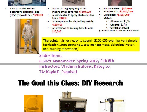
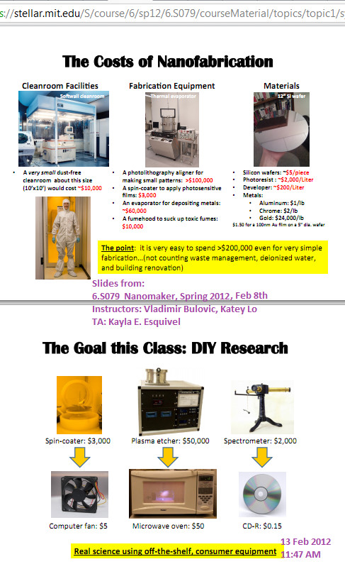
but to get back into the flow of microblogging / blogging everything, here is a screenshot of our first day slides from nanomaker, a class targeting underclassmen which I am randomly joining in as a junior.

Our first lab for this week is a CD spectrophotometer:
http://www.asdlib.org/onlineArticles/elabware/Scheeline_Kelly_Spectrophotometer/index.html

And we’re supposed to go through the intro to MATLAB:
http://ocw.mit.edu/courses/electrical-engineering-and-computer-science/6-094-introduction-to-matlab-january-iap-2010/