
Monthly Archives: February 2015
rant about software documentation / website trends
I draw my examples from open-source software (OSS) projects, but the latest webdesign trends in general really tick me off. I like objects that convey information well, and such objects we often find visually pleasing as well, but it we shouldn’t be sacrificing function for form, form should enhance function. Yes, I have strong opinions about design for conveying information.
Especially when I’m doing technical work, such as evaluating whether to adopt a piece of open-source software (for instance, try the picking a javascript tool to learn for the first time: d3, angularJS, node, flask, kinect.js, jQuery), I really appreciate “first contacts” that tell me in 10 seconds :
- What is this thing?
- Why would I care about this thing?
- Is it worth the effort to learn this thing?
Source: http://stevelosh.com/blog/2013/09/teach-dont-tell/, which is a post “about writing technical documentation for programming languages and libraries.” Really, read it if you are at all interesting in having anyone else use your OSS project. After all,
The purpose of technical documentation is to take someone who has never seen your project, teach them to be an expert user of it, and support them once they become an expert.
okay, so what’s wrong with the internet today, you might ask?
chief complaints
1) Dumb websites that are 5% content and 95% whitespace.
2) Why do I have to clone, install dependencies, and compile my websites now? Whatever happened to good ol’ HTML view-source copy-pasting?
complaints in rant-worthy detail
1) Whitespace is good in moderation. Yes, don’t be afraid of whitespace. No, don’t waste my time scrolling down through empty galaxies of space. WTF. Hasn’t anyone heard of designing “above the fold“?
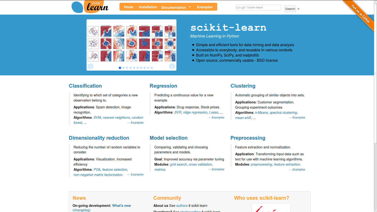
I’m not browsing for the latest python library to use on a tablet, I’m either on my laptop or my phone. What is this tablet interface thing? You can design for mobile / tablet without making your default website look butt-ugly on large monitors. I’m particularly ticked off right now because two of the projects I had bookmarked a month ago as being examples of “good homepage design” have converted into derp designs :/
december 2014
february 2015
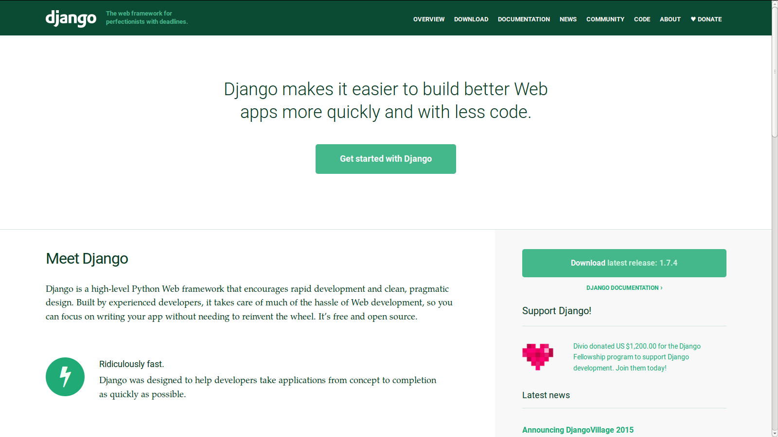
ugh, it’s like watching ubuntu upgrade into a progressively worse and worse UI-wise. (for the record, I use cinnamon and docky on Ubuntu 14.04 and I will fight to keep this working on my laptop). THERE’S SO MUCH USELESS WHITESPACE at the top left / right, ahhhhhhhh it’s infuriating to look at (I’m also really hungry, which is probably why I’m so grumpy right now)
As John Morris succinctly put it in Annoying Trends in Modern Web Design:
Minimalism is the practice of reducing fluff and streamlining websites. When done correctly, this is very pleasing to the eye and makes finding what you want easy. But when taken to far, your page becomes pointless.
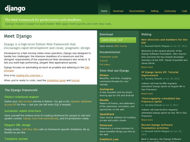
good design
Whitespace? Yes. Mobile-friendly? Yep, checks out on my phone. Conveys necessary information in an efficient manner? Yep.
The other website is getfedora.org, but I can’t find a “before” screenshot for them, so I’ll spare them for now.
—
I started on this post a week or two ago, and I can’t quite remember the other points I was going to make, nor do I feel quite so angry (I think I was tired, sleepy, and hungry at the time of this post), but upon further reflection, I think the key issue I have with all these sites obviously designed for the tablet is that,
1) on the desktop, there is no easy “page” metaphor where you flip between one section to the next with a swipe of your finger. If you’re going to treat tablet/mobile users as your first-class citizen, include navigation so that your site is intuitive on the desktop as well.
2) All the spaced-out, layered information (layered because you hid all the content under a metric ton of whitespace) (it’s clear people are designing for marketing: get them to click the button!) makes it very hard to build a mental map of your site. It’s like reading a book for ELDERLY PEOPLE WHO CAN’T SEE
EVERYTHING
IS
SUPER
SPACED-OUT
unnecessarily so. There’s a reason why everyone doesn’t just use the EXTRA LARGE FONT setting on their computers or ebook readers. It’s uncomfortable, and I can’t build a mental / visual map of where all the information is. Take this site:
https://www.shuttleworthfoundation.org/fellows/
This site is well-designed for consuming information / first-time users exploring the site, but not for linking to content or commenting on it or remembering where things where on the site.
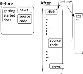
Before:
Getting started is up top, source code is to the right, news about the community over to the left.
After:
Getting Started: Click the top button, then the link in the first sentence on that page.
Source Code: Scroll down about halfway on the page.
News: Scroll down all the way on the page.
Conclusion
stop copying other people’s designs willy-nilly to look cool without thinking about the usability of your site. =___=
Rarsday Robot: Laundry notification, part 0
I keep going down to the basement to pick up my laundry too early and chilling around in the freezing cold hoping if I just wait another 30 seconds it will finish.
Our laundry machine is free (whoo! no hunt for quarters!) but has no indication of how long it takes. I just hit “start” and come back in about an hour. This seems like a great fast project for Rarsday Robots. Sadly, I did not finish, but here is my rough concept.
1) photodiode masked so it only detects the “cycle complete” LED turning on/off (such a convenient setup!)
2) arduino plugged into the wall in the basement (yay no batteries)
3) either run wires up two flights to an LED (sketchy, even at 5v, also a lot of wire for people to trip on / for me to find at 1 am in the morning) or
4) some wireless communications. Bluetooth? Then it could ping smartphones. Is the BLE4.0 nrf8001 breakout we were using strong enough to go up two flights? Not sure. Also would need to develop smartphone app. Other possibility, use IOIO with regular bluetooth dongle (fast, only need to develop in one language). Or, use the cheap nrf24l01+ chips I have dozens lying around of!

Well, it took me 30 minutes just to find two working arduino nanos that I hadn’t desoldered the atmega328 from or otherwise destroyed, as well as remember that my `sudo apt-get install arduino` is sad (gives stk500 errors) and use a .tar.gz downloaded version of arduino instead. Oh well. Next Rarsday!
Next step: test whether Cappie’s nrf24l01+ code still works
- https://github.com/capfish/swarmbotz/blob/master/arduino/groundstation/groundstation.ino (type anything into serial monitor)
- https://github.com/capfish/swarmbotz/blob/master/arduino/swarmbot/swarmbot.ino (watch serial monitor, should spit out what you typed)
Then test whether I get reception in the basement (set one to constantly emit something, see what I get out the other end on the 2nd floor. Ideally do this with someone else on the phone so I’m not constantly running up and down stairs).
The other part is to tweak around the photodiode / resistor (first, find one) until it works consistently, regardless of if the light is on or off in the basement or it is daylight or not (should be easy — just shield it well with tape). And put up a sign explaining what it does.
Finally, combine the two parts of the project. Voila, crappy laundry notification device. The second (receiving) arduino upstairs can do whatever, talk to your phone, the internet, or just blink an LED or LCD panel.
Further work: how to detect the dryer is done. Something that detects rumbling and runs it through a filter of some sort?x
Todo: buy more $3 arduino nanos
For your enjoyment: www.ruggedcircuits.com/10-ways-to-destroy-an-arduino/